You know that feeling when you put together an outfit and it just works? Everything feels cohesive, balanced, intentional. Then you try something else and it's... off. The pieces are nice individually but they don't speak to each other.
Most people blame it on luck or say they're "just not good with colour." But here's the thing: colour harmony isn't magic. It's about understanding whether you're naturally drawn to warm or cool undertones—and then building from there. Once you see this, you can't unsee it.
Core Concept
Every colour—whether gold or silver, terracotta or teal—carries an undertone. Warm colours lean toward yellow and red. Cool colours lean toward blue and green. Your personal undertone preference shapes which palettes will make you look awake, healthy, and intentional.
What Are Undertones, Really?
Undertone isn't about whether something's light or dark. It's about the subtle temperature hiding underneath. Take two blacks: one leans slightly green (cool), the other leans slightly brown (warm). Both are black. But they feel different next to skin.
The same applies to every colour you wear. A coral that's warm feels peachy and golden. A coral that's cool reads almost like a blue-tinged salmon. When you wear warm undertones and you're a cool-toned person, the colour doesn't sit right on your skin. It competes instead of complements.
Why It Matters
Wearing your undertone means colours appear more vibrant on you. Your complexion looks clearer. You need less makeup to look "done." Sounds small, but it changes everything about how confident you feel in an outfit.
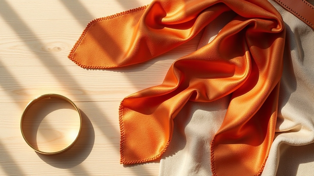
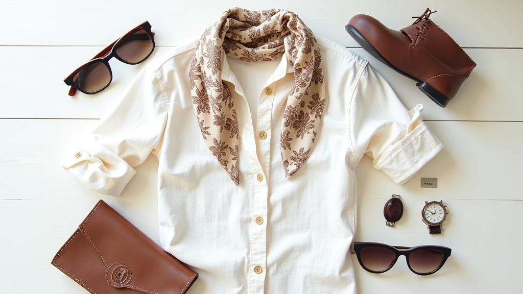
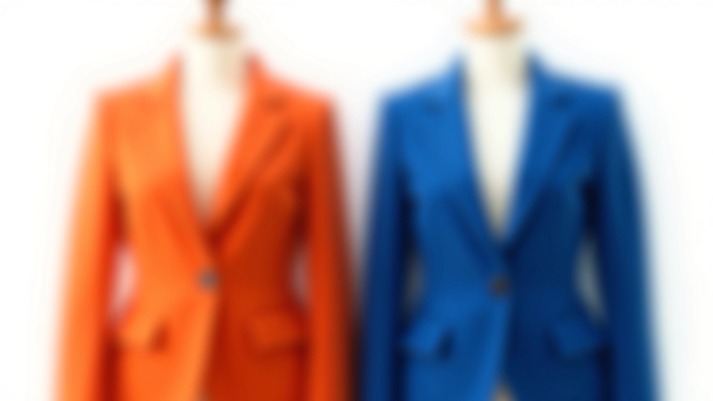
Warm Undertones: The Golden Palette
If you're warm-toned, you'll see yourself glow in oranges, warm reds, terracottas, golden yellows, and warm browns. Gold jewellery looks like it was made for you. Candlelight makes your skin look healthier. Warm neutrals like cream, camel, and warm grey feel like home.
The trick with warm palettes isn't going full safari. It's knowing that your jewel tones lean warm too. Think burnt orange instead of true orange. Olive green instead of kelly green. Warm burgundy instead of cool plum. The saturation and temperature work together.
- Gold metallics sit naturally against warm skin
- Cream and ivory feel richer than pure white
- Warm reds and oranges won't clash with natural undertones
- Warm greys and taupes act as sophisticated neutrals
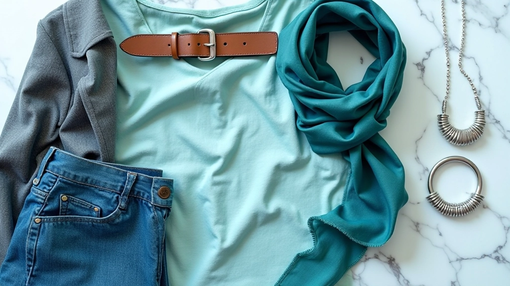
Cool Undertones: The Jewel Palette
Cool undertones come alive in silvers, jewel tones, true reds, cool blues, and jewel greens. Silver jewellery looks crisp on cool skin. Bright white or crisp cream reads clean and modern. The cool end of the neutral spectrum—greys, blacks with blue undertones, and cool taupes—becomes your foundation.
The strength of a cool palette is its versatility with jewel tones. Emerald green, sapphire blue, amethyst purple—these aren't trendy for cool-toned people, they're foundational. Pair them with silver and you've got instant polish. The colours support each other rather than compete.
Cool Neutrals
White, grey, black, cool taupe, navy
Cool Jewels
Emerald, sapphire, amethyst, ruby, teal
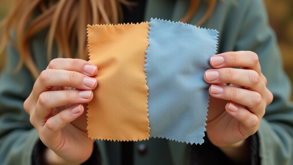
Finding Your Undertone: Simple Tests
You don't need expensive colour analysis to start experimenting. Hold a warm gold and a cool silver next to your wrist in natural daylight. Which one looks alive on your skin? Which one disappears?
Another quick test: look at the veins on your wrist. Blue or purple-ish veins suggest cool undertones. Green or greenish-yellow veins suggest warm undertones. It's not foolproof—some people have both—but it's a starting point.
The real test? Wear an outfit that's clearly warm-toned for a full day. Notice how you feel. Does it feel like you? Does your complexion look clear? Or does something feel off? Then try a cool-toned outfit. One will feel right. That's your answer.
Building Intentional Outfits from Your Undertone
Once you know your undertone, outfit building becomes easier. You're not fighting yourself anymore. Here's how to move from theory to actual clothes.
Choose Your Neutral Base
Start with a neutral that feels right for your undertone. If you're warm, reach for cream, camel, or warm grey. If you're cool, use white, grey, or black. This is your anchor. Everything else builds around it.
Add Your Metallic Accent
Jewellery and hardware matter more than people think. If you're warm, use gold, bronze, or copper. If you're cool, use silver, white gold, or platinum. This single choice pulls the whole outfit together because it echoes your natural undertone.
Pick One Strong Colour
Don't overthink this. Choose one colour that fits your undertone palette. Warm person? Try rust or olive. Cool person? Try emerald or navy. One strong colour creates focus. It makes the outfit feel designed rather than assembled.
Finish with Texture and Proportion
Now that your colours work, think about fabric weight and silhouette. A heavy wool coat in your undertone colour with your metallic jewellery looks intentional. A flimsy blouse in the same colour looks accidental. Texture and proportion complete the harmony.
The Real Takeaway
Understanding warm versus cool undertones isn't about rigid rules. It's about developing a critical eye for what actually works on you. Once you see it, you stop chasing trends that don't serve you. You stop buying things because they're pretty in the store but wrong on your body.
The most stylish people aren't those with the biggest wardrobes. They're the ones who've figured out their own palette and got intentional about it. They know why they reach for certain colours. They understand how their choices speak to each other. That's what colour harmony really is—intention.
Start paying attention. Notice what colours make you feel confident. Notice when something sits right on your skin versus when it competes with it. That observation is the beginning of real style development. Your undertone is just the language you're learning to speak.
Educational Note
This article is informational and based on general colour theory principles. Individual undertones and colour preferences vary widely based on ethnicity, skin depth, natural colouring, and personal taste. The concepts discussed here are guidelines for exploration, not absolute rules. Everyone's relationship with colour is unique. Use these principles as a starting point to develop your own critical eye, and trust what feels right for you above any external framework.