Walk through any high-fashion editorial spread and you'll notice something striking: most of it's beige. Not beige like your grandmother's couch—we're talking warm creams, soft taupes, sophisticated greys. It's not lazy design. It's actually the opposite. When you strip away colour, everything else becomes louder. The fit of a jacket. The way a seam catches light. The space between fabric and body.
Neutral palettes aren't about being boring. They're about understanding that sometimes what you remove matters more than what you add. This approach has dominated editorial for a reason. It works.
Why Editorials Love Neutral
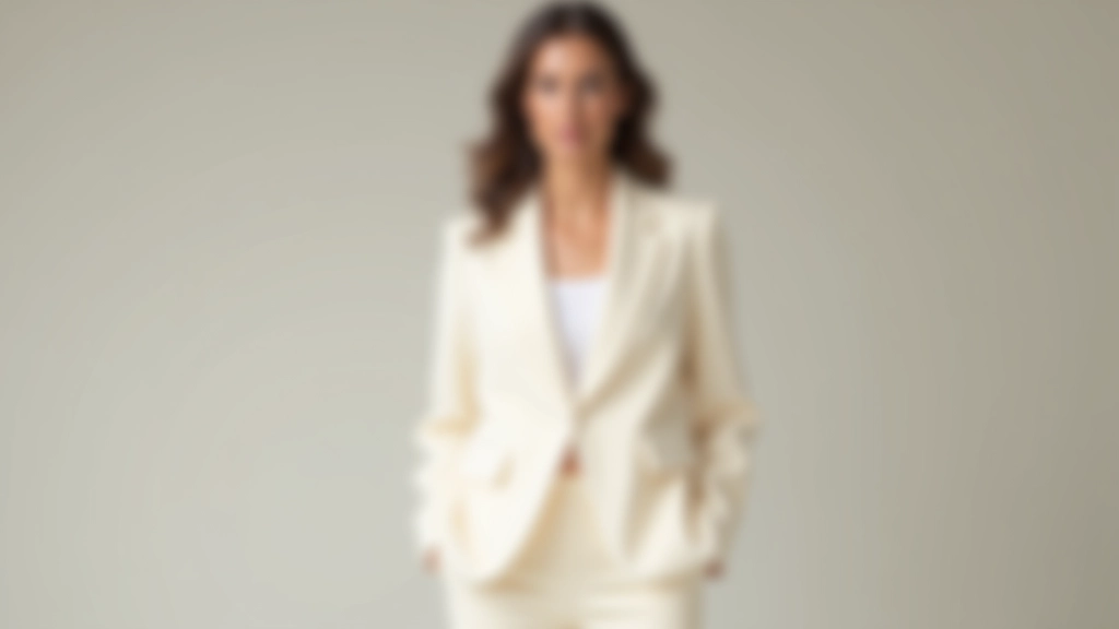
Editors aren't afraid of colour. They use it strategically. But neutral-dominated spreads have become a signature move in luxury fashion because they do something clever: they force the viewer's eye to focus on construction and silhouette. A perfectly cut camel coat becomes the star. The drape of linen trousers commands attention. Accessories matter more—a simple gold cuff, a structured bag, a pair of clean white sneakers.
There's also a practical reason. Neutrals photograph beautifully. They don't distract from the fabric texture or the way light plays across a garment. In magazines and online, this consistency creates a cohesive visual story. One outfit flows into the next. It feels intentional rather than chaotic.
Plus, neutral doesn't mean monochrome. We're talking layering different tones—cream over beige over soft grey. These subtle shifts in shade create visual interest without relying on bright colours.
The Power of Proportion in Monochrome
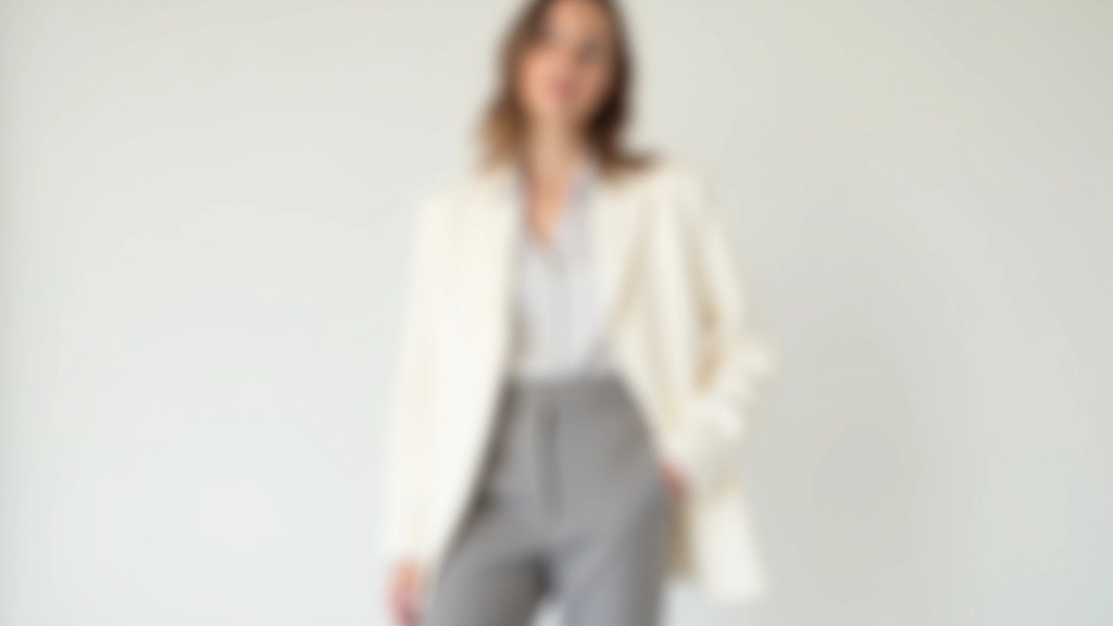
Here's where neutral palettes get interesting. When you're working within a limited colour range, proportion becomes everything. An oversized blazer needs to be balanced with fitted trousers. A voluminous skirt requires a fitted top. Suddenly you're thinking about shape and silhouette in ways colour usually distracts from.
Editorial designers understand this deeply. They'll pair a relaxed cream linen shirt with high-waisted tailored trousers. The shirt is loose, the trousers are precise. Together they create a visual rhythm. Without colour variation, this contrast becomes the focal point.
Accessories play a crucial role too. A structured bag in the same tone as the outfit creates harmony, but the bag's shape and hardware provide visual interest. A statement belt cinches the waist. These details wouldn't stand out as much in a colorful ensemble.
Translating This to Real Life
You don't need to wear only beige and grey to apply this thinking. But you can borrow the philosophy. Instead of throwing five colours into one outfit, try building within a palette. Pick two neutrals as your base—say, cream and charcoal—then add one secondary colour if you want. This immediately feels more intentional.
Focus on pieces that fit you well. A neutral palette shows off fit better than anything else. That slightly-too-big sweater you love? It works great with colour distracting. In neutrals, fit inconsistencies become visible. But when something fits properly, neutrals make it look expensive and deliberate.
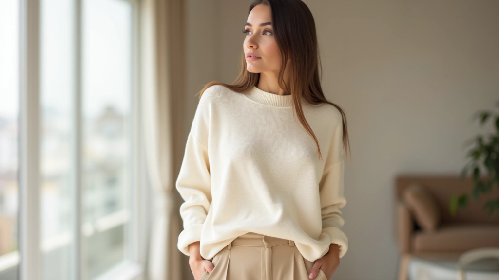
Think about texture too. If you're wearing neutrals, mixing textures—linen with cotton, wool with silk, suede with smooth leather—creates the visual interest that colour would otherwise provide. A cream wool sweater with cream silk trousers shouldn't feel boring. The texture difference makes it interesting.
The Technical Details That Matter
Undertone Consistency
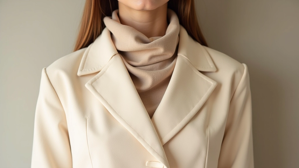
Warm beiges and cool greys clash. Pick a direction—warm or cool—and stick with it. Editorial stylists spend time ensuring all neutrals in an outfit share the same undertone family.
Fabric Weight Matters
Heavier fabrics in neutral tones look luxe. Light fabrics can feel cheap. Editors pair crisp cotton with substantial wool, linen with structured cotton blends.
Fit is Non-Negotiable
In a neutral palette, every seam shows. Every length is visible. Editors insist on proper tailoring because neutral outfits can't hide fit issues.
Accessory Contrast
Neutrals need a focal point. Editors often introduce one contrasting element—black shoes, a gold bracelet, a structured bag—to anchor the look.
The editorial approach to neutral dressing isn't about limitation. It's about clarity. Every choice becomes deliberate. Every piece earns its place through fit, texture, or proportion rather than colour. When you adopt this mindset, your outfits shift from looking like you got dressed to looking like you have a point of view.
The Takeaway
Neutral palettes dominate editorial fashion because they're effective. They highlight construction. They photograph beautifully. They feel sophisticated. But most importantly, they require you to think about your clothes differently. You can't hide behind colour. You have to consider fit, proportion, texture, and balance.
You don't need to adopt an all-neutral wardrobe to learn from this approach. Start by building one or two outfits using a restricted palette. Pay attention to how fit and proportion matter more than you might expect. Notice how texture creates visual interest. See what happens when you remove colour as a crutch.
That's what editorials have been showing us all along: sometimes less really does look like more.
Disclaimer
This article provides educational information about fashion styling, outfit construction, and design principles observed in editorial photography. Style recommendations are based on common editorial practices and design theory, not personal fashion advice. Individual style choices depend on personal preferences, body type, lifestyle, and cultural context. Consider consulting with a professional stylist for personalized guidance on building a wardrobe that works for your specific circumstances and needs.